The World Map Is Lying to You: Sep 4, 2026 Why the UN Wants Africa to Look Its True Size
For centuries, the world has been looking at a map that makes Africa appear far smaller than it really is. Now, the United Nations wants to change that.
On 4 September 2026, the UN General Assembly overwhelmingly backed the “Correct the Map” resolution, encouraging governments, schools, international organisations and technology companies to use maps that represent the relative size of the world’s regions more accurately.
The vote was striking: 164 countries voted in favour, one voted against and six abstained.
At the centre of the debate is the Mercator projection, the familiar rectangular world map that has shaped how generations of people picture the planet.
The problem? Africa is much bigger than it looks.
Why does Africa look so small on every world map?
The Mercator projection was created by Flemish cartographer Gerardus Mercator in 1569. It was not designed to give people an accurate impression of the relative size of continents. Its purpose was practical: helping sailors navigate.
Mercator’s projection preserves angles and makes lines representing constant compass directions appear straight. That made it extremely useful for maritime navigation.
But there was a trade-off, as the further a landmass is from the Equator, the more its apparent size is exaggerated. Regions in the far north and south therefore appear much larger than they really are, while areas around the Equator appear comparatively smaller.
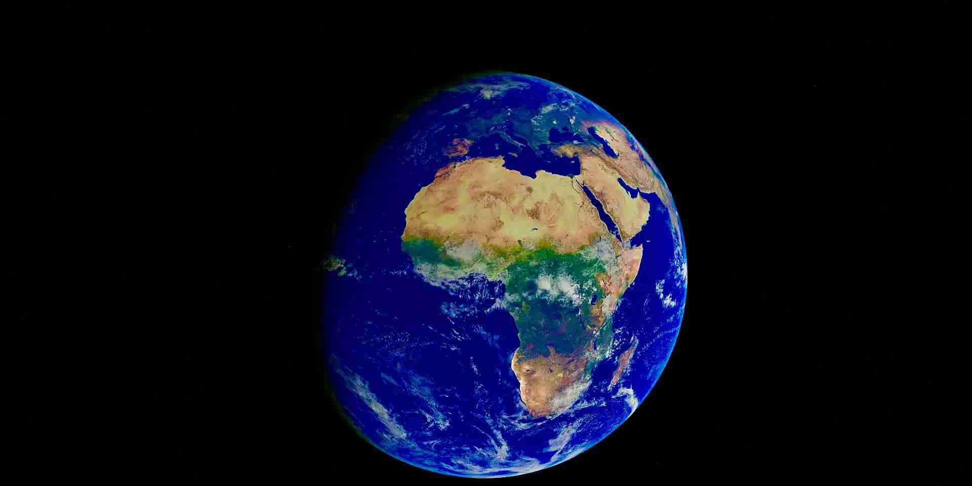
The most famous example is Greenland. On a traditional Mercator map, Greenland can appear comparable in size to Africa. In reality, Africa is roughly 14 times larger than Greenland.
And there is an even more revealing comparison: Greenland is approximately the same size as the Democratic Republic of the Congo (DRC), yet on a Mercator world map, Greenland can look enormous.
That visual discrepancy is at the heart of the “Correct the Map” campaign.
What does the UN want to change?
The UN resolution promotes the use of equal-area map projections, particularly Equal Earth, when the relative size of countries and continents matters.
Developed in 2018, Equal Earth is designed to preserve the relative area of landmasses. Africa consequently appears much closer to its actual scale, while Europe, North America and other regions farther from the Equator appear smaller than they do on Mercator.
But there is an important distinction: the UN has not banned the Mercator projection. The resolution is non-binding and does not require every world map in the world to be replaced. Nor does it suggest that Mercator is scientifically “wrong” for every purpose. Mercator remains useful for navigation precisely because of the properties that make it distort area.
The message is essentially that there is no single perfect world map. Every flat projection of a spherical planet involves compromises involving area, shape, distance or direction. The question is which compromise makes sense for the purpose. If you are navigating a ship, Mercator can be extremely useful, but if you are teaching children the relative size of continents, an equal-area projection makes considerably more sense.
Why is this about more than geography?
This is where the debate becomes much more controversial.
The African-led campaign argues that maps do not simply show the world, but they influence how people understand it.
Togo, which led the negotiations on behalf of the African group, argued that repeated exposure to distorted maps can contribute to what the UN resolution describes as the “symbolic minimisation” of Africa. Togo’s Foreign Minister Robert Dussey framed the issue in particularly direct terms, arguing that maps shape education, imagination and collective perceptions.
The argument is not that Mercator was deliberately invented to make Africa look small. Its original purpose was navigation, and that distinction matters. Rather, campaigners argue that a world map created for a specific 16th-century purpose became a dominant visual representation of the entire world long after its original context had disappeared.
The African Union has backed the campaign, turning what might initially sound like a technical cartographic discussion into a broader conversation about representation, colonial legacies and how Africa is perceived globally.
What about the Democratic Republic of the Congo?

The DRC provides one of the most striking examples of the issue.
Covering roughly 2.34 million square kilometres, the Democratic Republic of the Congo is one of Africa’s largest countries. It stretches across the Equatorial region, where Mercator’s area distortion is relatively limited compared with countries at higher latitudes. Yet the comparison with Greenland reveals the problem immediately. Greenland and the DRC are roughly comparable in actual area. On the familiar Mercator world map, however, Greenland’s position far north causes its apparent size to be dramatically inflated.
This is why looking at individual countries can be so revealing. The problem isn’t simply that “Africa looks small”; it is that the visual hierarchy created by the map can make enormous equatorial countries and regions seem less significant in scale than they actually are.
The same principle applies to the Republic of the Congo, although it is substantially smaller than its neighbour, the DRC. Both Congos sit in Central Africa, close to the Equator, where the Mercator projection does not inflate their areas in the way it does for northern territories.
Why did the United States oppose the resolution?
The vote was almost unanimous, but the United States rejected the proposal.
The American representative argued that the resolution was part of a broader ideological agenda and criticised references to concepts such as “cognitive justice” and “memorial reparation.” The US position was that the UN should focus on more pressing international issues rather than what it viewed as an ideological reframing of cartography.
Other countries raised different concerns. Ukraine, for example, supported the effort to address historical distortions affecting Africa and other parts of the Global South but expressed concern about how certain equal-area maps could portray territories occupied by Russia.
The European Union also supported the resolution while stressing that adopting a particular projection should not affect questions of sovereignty, borders or territorial status.
France has taken a notably different position from the United States. On the same day as the UN vote, French Foreign Minister Jean-Noël Barrot announced that France would move away from Mercator for its world maps, adopting the Eckert IV projection. It is an equal-area projection and, like Equal Earth, gives equatorial regions a much more proportionate visual representation.
The result is visually striking: Africa and Latin America appear larger, while Europe and North America appear smaller. That does not mean those regions have physically changed. It means the map has.
Will the world actually stop using the Mercator map?
Probably not. And that is an important part of the story.
The UN resolution is not legally binding, and it does not force Google, schools, publishers or governments to abandon Mercator overnight.
Togo, however, says it intends to lead by example, including plans to update its school geography materials by the end of 2026. The country also intends to work with African Union members, other governments and technology companies involved in mapping and location services.
The bigger change may therefore happen gradually. Maps used in classrooms could change. Educational textbooks could change. Infographics, media graphics and institutional maps could increasingly use equal-area projections. And as those images become more familiar, the way people instinctively visualise the world could change with them.
A world map cannot be completely “correct”
There is an irony at the heart of this entire debate. As mentioned above, there is no perfect flat map of Earth.
The planet is a sphere. The moment you try to flatten that sphere onto a sheet of paper, or a computer screen, something has to give. Mercator sacrifices accurate area to preserve direction and angles. Equal Earth sacrifices some other properties in order to preserve relative area.
Neither is simply “the correct map”.
The bigger picture
The UN’s “Correct the Map” vote is therefore not really about making Africa physically “bigger”. Africa was always that big. The vote is about changing the picture in our heads.
And perhaps that is the most important lesson of all: maps do not merely tell us where things are. They can influence what we think those places are worth, how large they are in our imagination, and how we understand the world around us.
If you enjoyed reading this article make sure you check more on our site. From Congo to the World isn’t just storytelling, it’s a cultural journey. A mash-up of travel, people, and traditions, told with the bold, creative spirit of Congo as our compass.